
Text (+ image)
The text component is one of the basic building blocks of your site. It allows you to add text (and an optional image alongside the text) to any page and/or applicable post type.
The text you’re reading is an example of a text component with an image added!
Once you’ve added a text component to your page, enter:
- A brief header for your information.
- A header is required for accessibility purposes, but you can choose for it to be hidden from view.
- The rich text you want to appear on the page.
- Rich text (as opposed to plain text) allows formatting like heading styles, bold, italic, blockquote, in-text links, and bulleted and numbered lists.
- Use heading levels to denote the hierarchy of information. This is important for both accessibility (screen readers and other assistive tools use heading levels to navigate the page) and SEO.
- Use Heading 3 formatting to start a new section, and headings with a lower rank (Heading 4, Heading 5, and Heading 6) to start new subsections that are part of the higher ranked section.
- Don’t skip heading levels for aesthetic reasons. For example, don’t directly follow a Heading 3 with a Heading 6.
- An optional image. Images used in the text component must be at least 500px wide.
- If you add an image, you will need to add alt text as well. Alt text is a core part of making your content accessible. Pretend you’re describing the image to someone who can’t see it, in a short (about 10 words) sentence. Focus on what’s most important; don’t worry about every detail.
- You can add an optional caption to the image.
- Choose the placement of the image, which determines where it will appear relative to the text. (This only applies to large enough screens; on smaller screens like phones, images will stack above or under text.)
- Choose the size of the image, which determines whether it will appear at ½ or ⅓ width. (If you want to add a full-width image instead, use the image component.)
- Choose whether to enable a lightbox for the image. When enabled, site visitors can click on the image to see the full-size version against a dimmed background.
- If you add an image, you will need to add alt text as well. Alt text is a core part of making your content accessible. Pretend you’re describing the image to someone who can’t see it, in a short (about 10 words) sentence. Focus on what’s most important; don’t worry about every detail.


Example of an image open in a lightbox.
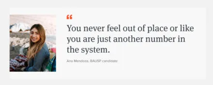
Quote
A quote component highlights a text testimonial (by a student, alum, or faculty member, for example) with options to add an image and call to action. Real words from real people can be very compelling when it comes to helping prospective students “see themselves” at your school.
Once you’ve added a quote component to your page, enter:
- The quote text. Make sure it’s not overlong!
- Text attribution for the quote; the name of the person being quoted. You could also add a short description of the person if relevant; for example, “Jane Doe, MUP 2025.”
- An optional image of the quoted person. Portrait-orientation (tall) images work best.
- If you add an image, you will need to add alt text as well. Alt text is a core part of making your content accessible. Pretend you’re describing the image to someone who can’t see it, in a short (about 10 words) sentence. Focus on what’s most important; don’t worry about every detail.
- An optional call to action. A call to action creates a button that links site visitors to a next step or page where they can learn more information(for example, a link to program information mentioned in the quote, or a link to a published feature about the quoted person). Choose the text that will display and the page (internal or external to your site) that you want to link to.

The real object of university education is to furnish preparation for efficient social service.
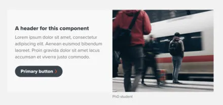
Topic block
A topic block component is a great way to add visual interest to information about a particular subject, and to optionally link to more information about that subject.
Once you’ve added a topic block component to your page, enter:
- A brief header text that introduces the topic.
- A header is required for accessibility purposes, but you can choose for it to be hidden from view.
- An optional image (minimum dimensions 430×350) that will appear inside the component.
- The alt text for your image. Alt text is a core part of making your content accessible. Pretend you’re describing the image to someone who can’t see it, in a short (about 10 words) sentence. Focus on what’s most important; don’t worry about every detail.
- An optional caption for your image.
- Text that gives more information about the topic. This should be a very manageable paragraph at most (if you’re linking to a page with more information, think of this text as the “snack” that entices a site visitor to eat the full “meal”).
- An optional call to action. A call to action creates a button that links site visitors to a next step, or a page where they can learn more about the subject highlighted in the topic block. Choose the text that will display and the page (internal or external to your site) that you want to link to.

Photo by Jack Chen
Example of Topic Block component
The mission of the Undergraduate Library is to provide academic, co-curricular, cultural, and technological support to our users and to be a dynamic, innovative unit.
Every interaction between the Undergraduate Library and its users should enhance and enrich the undergraduate experience so that students can adjust to and succeed at the University of Illinois and beyond.