
An example of an alumni feature block.
Feature block
The feature block component highlights and previews published alumni feature and student feature posts.
Once you’ve added a feature block component, enter:
- A brief header for the component.
- A header is required for accessibility purposes, but you can choose for it to be hidden from view.
- Whether you’re highlighting published Alumni or Student features.
- In the Add a person field, click to see a list of published features you can choose from, and/or start typing the name of a featured person to choose them. Choose as many alumni or students as you want.
- An optional call to action. A call to action creates a button that links site visitors to a next step or page where they can learn more information (for example, the student or alumni features listing page). Choose the text that will display and the page (internal or external to your site) that you want to link to.
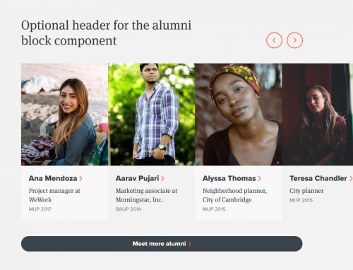
An example of an alumni feature block.
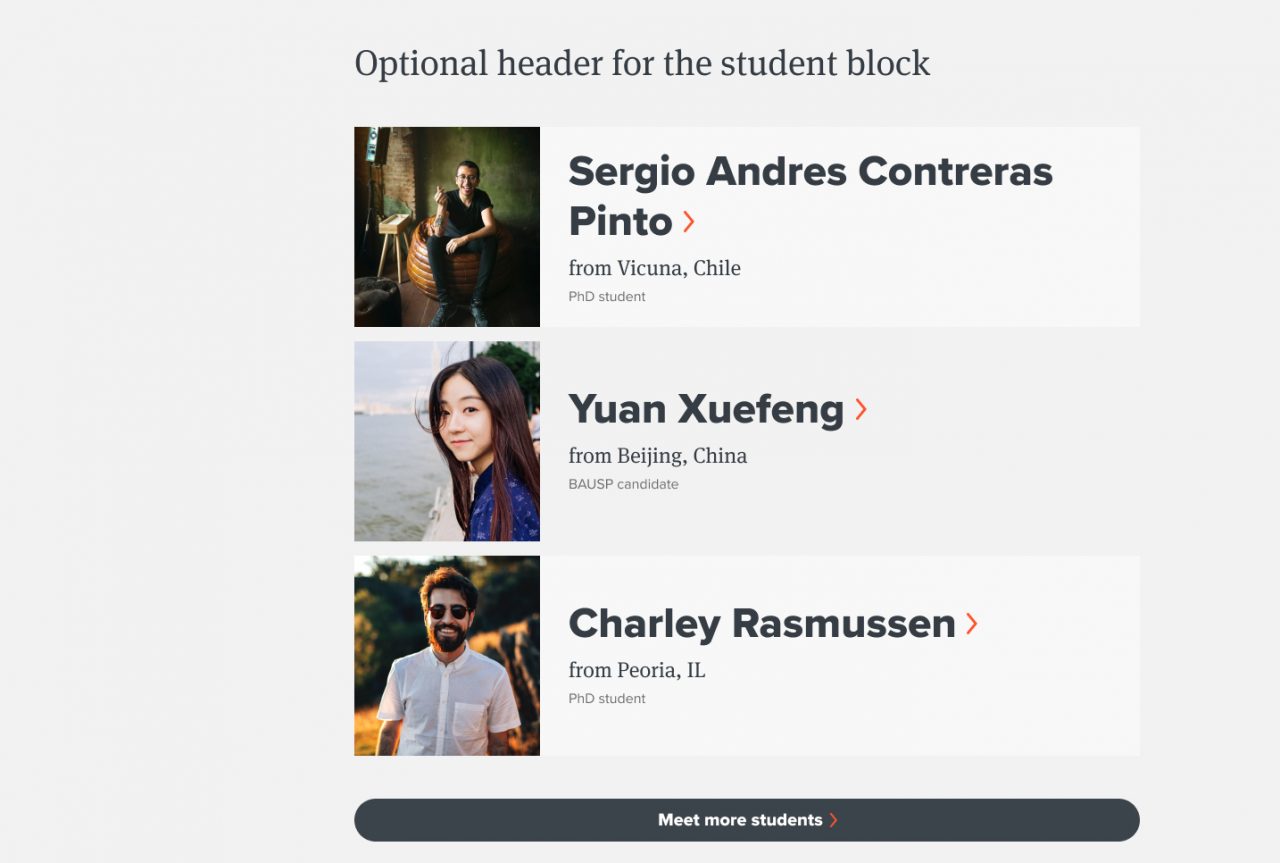
An example of a student feature block.
News mini
The news mini component highlights and previews recent published news stories on your site.
You cannot choose specific news posts to feature in this component. You can specify [LINK TO: using tags and taxonomies]tags to filter by, such as “student news” or “alumni news.”
Once you’ve added a news mini component to your page, enter:
- A brief title, e.g. “Recent news.”
- The number of news posts the component will display (a number between 1 and 5 works well).
- Tags to filter the types of news posts that will display. You can choose any combination of tags that exist for the news post type on your site. Learn more about using tags to filter posts.
- If you don’t choose any tags, the most recent news stories published on the site will display in the component.
- If you choose tags, but no news stories on the site are published with the tags you chose, nothing will display in the component.
- An optional call to action. A call to action creates a button that links site visitors to a next step or page where they can learn more information (for example, the news listing page). Choose the text that will display and the page (internal or external to your site) that you want to link to.
Profile mini
The profile mini component highlights and previews published faculty and staff profiles on your site.
The profile mini component is great for highlighting contact information for people. Use it on admissions pages or alongside other content where site visitors may be looking for someone who can answer questions.
Once you’ve added a profile mini component to your page, enter:
- A brief title for the component.
- In the Contacts section, start typing the name of a person to choose their profile. Choose between 1 and 5 profiles to feature.
- An optional call to action. A call to action creates a button that links site visitors to a next step or page where they can learn more information. Choose the text that will display and the page (internal or external to your site) that you want to link to.
Work mini
The work mini component highlights and previews recent published work posts on your site.
You cannot choose specific work posts to feature in this component. You can specify tags to filter posts, such as “student work” or “faculty work.”
Once you’ve added a work mini component to your page, enter:
- A brief title, e.g. “Creative works by current students”
- The number of work posts the component will display (a number between 1 and 5 works well).
- Tags to filter the types of work posts that will display. You can choose any combination of tags that exist for the work post type on your site. Learn more about using tags.
- If you don’t choose any tags, the most recent work posts published on the site will display in the component.
- If you choose tags, but no work posts on the site are published with the tags you chose, nothing will display in the component.
- An optional call to action. A call to action creates a button that links site visitors to a next step or page where they can learn more information (for example, a work listing page). Choose the text that will display and the page (internal or external to your site) that you want to link to.