Divider
The divider component adds a simple vertical line to your page. It can help visually distinguish sections.
There are no fields or options for a divider once you’ve added one to your page.
See an example of a divider component below!
Table
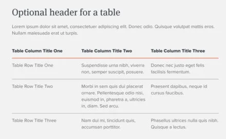
A table component is useful to display content that’s best understood in rows and columns, like application deadlines or tuition information for different programs.
Once you’ve added a table component to your page, enter:
- A brief title for the table.
- A title is required for accessibility purposes, but you can choose for it to be hidden from view.
- A caption for your table. Use this caption to add more context for the information in the table, such as an original source. A caption is required for accessibility purposes, but can be hidden.
- Whether you want row headers included on the table (yes/no).
- Whether you want column headers included on the table (yes/no).
- Use the + and – icons in the Table section to add columns and rows to your table, then type your table content into the cells.
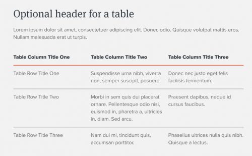
Example table component
This caption can add more context for the information in the table, such as an original source.
| Fall admission | Spring admission | ||
|---|---|---|---|
| Application opens | August 1 | June 1 | |
| Application deadline | December 15, 11:00 PM CST | September 15 | |
| Decision notification date | February 1 | October 15 | |
| Last day to accept admission offer | April 15 | November 2 |
Embed code
An embed code component is used only to embed third-party code that you know is safe.
Only multisite editors with Super Admin access can add or edit an embed code component. Other editors can see, move, and delete the component, but not edit it.