
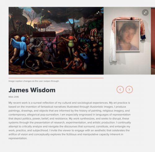
A gallery component using the slideshow view.
Gallery
Think of a gallery component as a virtual gallery for images and/or video.
The main focus of the gallery is a media slideshow, accompanied by a description of the work.
For example, you can use the gallery component to highlight:
- A specific person’s creative and/or research work
- The creative and/or research work of a class or cohort
- Images and/or video walkthroughs of a particular facility
Once you’ve added a gallery component to a page, enter:
- A title, e.g. the name of an artist, course, or facility
- A title is required for accessibility purposes, but you can choose for it to be hidden from view.
- A short description of the subject that will appear below the title, if added. You could put a short artist’s quote here, a summary of the work’s impact, or any other brief text that will add to the site visitor’s understanding.
- The body, which is the fuller text description. This is the place for an artist’s statement, for example, or to list the relevant features of a facility.
- The media will appear in the slideshow at the top of the gallery component. You can add images and embed video (by entering YouTube or Vimeo URLs). Enter the media in the order you want it to appear in the slideshow.
- The media size determines how prominently the media will display. If you want to show off high-resolution images of a visual creative work, for example, you might want to choose the Large size. If you’re highlighting a facility and using images that are more functional than beautiful, you might want to choose the Medium size.
- A call to action, if needed. A call to action creates a button that links site visitors to a next step, or a page where they can learn more about the topic, artist, facility, etc. featured in the gallery. Choose the text that will display and the page (internal or external to your site) that you want to link to.
A gallery component using the slideshow view.

An optional caption for this image
An optional caption for this image


An optional caption for this image
An optional caption for this image


An optional caption for this image
An optional caption for this image
An optional caption for this image
An optional caption for this image
Example of Gallery component
A short description of the subject (short artist’s quote, summary of the work’s impact, or other brief text)
A fuller text description. This is the place for an artist’s statement, for example, or to list the relevant features of a facility.
Image
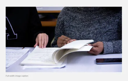
Add an image and optional caption to your page using the image component.
(Note that if you want to add an image alongside text, you can do so with the text component. The image component adds an image only)
Once you’ve added an image component to your page, enter:
- The image you want to show. Landscape orientation will look best, and the image has to be at least 1280px wide.
- Squoosh is a great free resource for resizing your images (cropping and/or reducing the file size).
- The alt text for your image. Alt text is a core part of making your content accessible. Pretend you’re describing the image to someone who can’t see it, in a short (about 10 words) sentence. Focus on what’s most important; don’t worry about every detail.
- A caption for your image, which is optional.


A caption for this image.
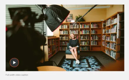
Video
Add a video player and optional caption to your page using the video component.
Once you’ve added a video component to your page, enter:
- The YouTube or Vimeo URL of the video you want to display.
- A caption for your video, which is optional.
