Call to action
Call to action (CTA) buttons are common throughout the multisite. You can add a call to action as an option on several other components, to suggest a next step for site visitors.
The call to action component adds the button on its own, or with an optional header.
Once you’ve added a call to action component to your page, enter:
- An optional header text. This is often a question, highlighting a readiness for site visitors, e.g. “Ready to take the next step?” If you don’t include a header, the CTA button will stretch to full-width.
- The call to action text, a very short (1-3 words), verb-driven phrase. Be as specific as possible to help the site visitor understand what will happen. For example, “Discover all our programs” is more specific and useful than “Learn more.”
- The link information for your CTA. You can link to an internal page (another page on your site) or an external page (a page on a different site).

Example of Call to Action component

Jumbo call to action
A jumbo call to action component allows you to add more than one call to action (ideally more than two) to the same component, with accompanying visual icons.
Once you’ve added a jumbo call to action component to your page, enter:
- An optional header text. This is often a question, highlighting a readiness for site visitors, e.g. “Ready to take the next step?” If you don’t include a header, the CTA button will stretch to full-width.
- Click Add Link List to add a new call to action to the component. We recommend adding at least two or more calls to action. (If you only need one, use the call to action component instead!)
- For each call to action, enter:
- The text for each call to action, a very short (1-3 words), verb-driven phrase. Be as specific as possible to help the site visitor understand what will happen. For example, “Discover all our programs” is more specific and useful than “Learn more.”
- The link information for your call to action. You can link to an internal page (another page on your site) or an external page (a page on a different site).
- The link icon you want to display alongside the text. Choose an icon that relates to the CTA, to help site visitors understand the context.

Available icons for the jumbo call to action component: Edit, Chevron, Location Marker, URL Link, Chat, Calendar, Person, Question Mark.
Example of Jumbo Call to Action component

Link cards
A link cards component displays links in visual “cards” to catch your site visitors’ eyes and allow you to add valuable context.
It’s common to use link cards in the multisite to link to specific program or degree pages. Link cards are also useful for highlighting key pages in a section, especially on [LINK to landing pages] landing pages.
Once you’ve added a link cards component to your page:
- Click Add a link card to add a new card to the component. Add at least two.
- For each link card, enter:
- The text that will appear at the top of the card. This should be a straightforward title for what you’re linking to, for example, the name of a program or a student-run organization.
- A description for the card, about 10-20 words. A summary or description of what you’re linking to; for example, learning objectives of a program or more context about a student-run organization.
- An optional image for the card. If you add an image, you will need to add alt text as well. Alt text is a core part of making your content accessible. Pretend you’re describing the image to someone who can’t see it, in a short (about 10 words) sentence. Focus on what’s most important; don’t worry about every detail.
- The link information for your call to action. You can link to an internal page (another page on your site) or an external page (a page on a different site).

A short (about 10-20 words) summary or description of the subject of your link, e.g. the benefits of a program or student organization.
A short (about 10-20 words) summary or description of the subject of your link, e.g. the benefits of a program or student organization.

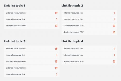
Link list
A link list component allows you to display multiple groups of text links.
Link lists are useful for “resource”-style pages that require linking to lots of files, pages, or other sites.
Once you’ve added a link list component to your page:
- Click Add a link list to add a new list.
- For each list you add:
- Enter a name for your list. (Make sure it’s meaningful for your site visitor!)
- Click Add a link to add your first link.
- For each link you add, enter:
- The text for your link.
- The link information. You can link to an internal page (another page on your site) or an external page (a page on a different site).